Ok then ! Now the 30DayMapChallenge 2020 is over, we just have to go back to our daily stuff and wait 2021 to see so many amazing maps !
One of my personal interests is to represent data, geographical or not, and I began to learn Python this year, to complete my skilss.
So, I decided to use all the material which was produced during the challenge to train myself, and in the same time, produce some dataviz and looks for insights ![]()
You will find here, as it is written, all the dataviz and the figures that will come out of it.
Dataset
To realize a good dataviz, we need a good dataset. I just pick up the awesome work done by David Friggens, which put all the submissions he could get here. I enhance his Google Spreadsheet crawling Twitter with Twint, which is a really good tool by the way.
(If anyone is interested about how I’ve done all this part of work, I could write an article about it later)
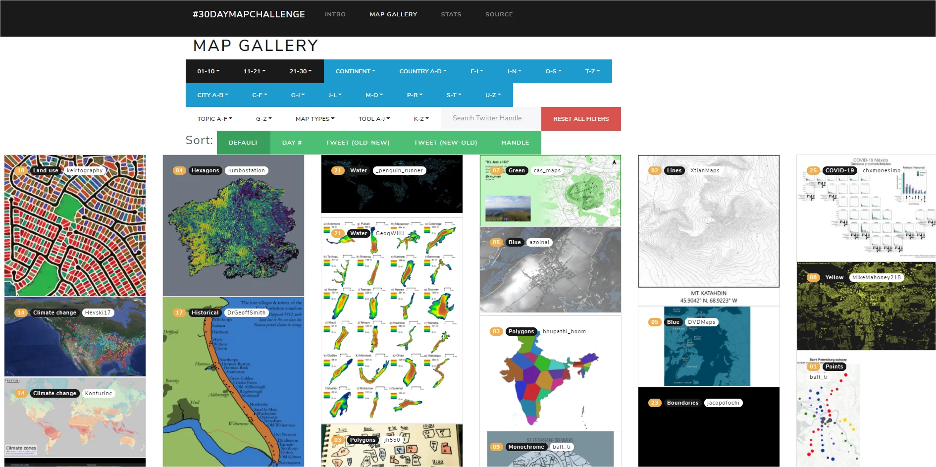
By the way, if you didn’t know it David did an awesome work to collect all maps, and you can see them here !
Moreover, if you see one map missing or if you want to add some metadata on it, feel free to read some instructions here.

Finishers
To start exploring the dataset, I decided to honour finishers ![]() ! Those crazy girls and boys who have done (at least) one map a day, for each daily theme.
! Those crazy girls and boys who have done (at least) one map a day, for each daily theme.
I really don’t know for who you’re working guys, but I guess geo-productivity just decreased during november ![]() .
.
For the moment, and for what I could get, I identified 76 finishers !
You can see below the statistics linked to all of the finishers on the date of December 12th 2020.
I did it with Plotly, and I’m gonna put the code on some gist soon.
In summary, it represents :
-
2,310 tweets

-
2,366 replies
 -the submission with the largest number of replies has 29
-
9,243 retweets
 -the submission with the largest number of retweets has 235
-
53,056 likes
 -the submission with the largest number of likes has 941
I’ll develop this kind of social statistics later, with all submissions, for sure !
On the next viz, you’ll find every finisher, with the number of tweets, and social statistics by hovering each bar.
If you’re on mobile device, I would advise you to put it on landscape mode.
You can click here too, to visualize it in full screen
Global statistics
Regarding all the participations, I count:
- 833 participants
- 7,184 maps, with an average of 240 maps a day…
- 136,266 likes
- 24,740 retweets
It begins to make a bunch of maps, and liking and retweeting people!
To explore this data more visually, I designed a dashboard via Bokeh, to continue to train in new tools and to change a bit of Plotly.
The start-up displays the data per day, aggregated for all entries.
You can select a specific participant via the selection bar at the bottom of the application.
You can click here to display it on a new page.
Unfortunately, I have not yet managed to find a way to display, for mobile devices, the data that is available by hovering the mouse over each bar…
On the technical side, I hosted it on Heroku.
I’m thinking about to write a tutorial on the purely pythonesque path of all this (Twint, Plotly and Bokeh side) and on how to deploy an application on Heroku. All of this is not very complex, but it may deserve to keep in mind some tricks and pitfalls in which not to fall.
Some observations on this data :
- Huge success for starting the challenge, day 1 (Points) was the one with the most likes (12,336) and retweets (2,365).
There is a sort of median plateau around 4,500 likes on the rest of the days, with 3 peaks for days 2 (Lines), 11 (3 D) and 12 (Maps made without GIS software). It is likely that these last 2 themes are more likely to produce more generic engagement.
Day 25 (COVID-19) is the one with the least likes (1,982), probably due to 2 factors: the overflow of people for this theme and the approach of Thanksgiving in the United States (as noted by Nicolas Lambert on his own statistics) - Finishers are huge providers of content (obviously) but also of likes and retweets.
– They represent 9% of participants with 2,310 maps (32% of total submissions)
– Their maps represent 37% of every likes and tweets
To be continued…


Laisser un commentaire